As a branding strategist, I work with mom entrepreneurs from all over the world and all walks of life in creating brands in different fields, and the one question that always comes up is “How do I choose my brand colors?”
Your brand colors are NOT your favorite colors. Choosing the colors you think best represent your brand must be an intentional process involving a lot of research, study, and reflection, and – like much of the branding process – it is NOT about you.
Color holds power in branding. 93 percent of people make purchase decisions based on color and visual appearance.
Color is a key component of your brand’s visual identity. Your logo will be made up of words, symbols, shapes, and numbers, and color is the most memorable component, increasing brand recognition by up to 80%.
Color affects how people feel when they experience your brand. Color can also make your brand stand out from others in your industry or field when chosen well.
To get you started thinking about your brand colors, think about the words that represent your brand meaning, culture, and personality.

What colors represent the characteristics you want your brand to be known for?
What colors communicate the message you want to convey, the story you want to tell?
What colors evoke the feelings you want your audience to feel, the mood you want to set?
Besides thinking about shades of color, take into consideration the texture and how matte or glossy might alter or affect the message you want to convey with your brand.
The Meaning of Colors in Color Psychology
Now let’s explore these color meanings to make sure you are sending the right message with the right colors:
The Meaning of Red ~
Do you think red is perfect for your brand? If you want to communicate power, passion, desire, danger, action, love, confidence, strength, courage, or sexuality, then red is perfect for you.
Red is a bold, lively, vibrant, energetic and intense color associated with romance, joy, vigor, willpower, leadership, lust, longing, sensitivity, rage, anger, danger, malice, wrath, stress, action, vibrance, radiance, energy, and determination.
Red is assertive, daring, determined, energetic, powerful, enthusiastic, impulsive, exciting, and aggressive.
Studies show that the color red is hot and stimulating and can create physical effects such as elevated blood pressure, enhanced libido, increased respiratory rates, enhanced metabolism, increased enthusiasm, higher levels of energy, and increased confidence.The color red is able to focus attention quickly and get people to make quick decisions.
The Meaning of Orange ~
Orange gives a fresh and healthy feel to your brand as it blends the energy of red and the happiness and optimism of yellow. The color orange communicates activity, energy, youthfulness, creativity, and adventure.
The color orange is flamboyant and is often used to draw attention and get noticed (think traffic signs and ads) and it is associated with joy, sunshine, autumn, and the tropics.
Orange can represent enthusiasm, fascination, happiness, creativity, freedom, expression, health, fun, fascination, determination, attraction, success, encouragement, stimulation, cheerfulness, excitement, enjoyment, balance, and sexuality, and provides a sensation of heat and warmth.
Orange is an active color because it makes us react by gut feeling, and by what we feel at that particular moment. Orange can create a sense of general wellness and emotional energy and can even help an individual recover from disappointments, a wounded heart, or a hard blow to one’s pride.
Orange can also help aid decision-making, and enhances happiness, confidence, and understanding.
Studies show that the color orange can promote physical effects such as increased hunger, heightened sense of activity, increased socialization, boost in aspiration, stimulated mental activity, increased oxygen supply to the brain, increased contentment, and enhanced assurance. Isn’t that fascinating?
Beware though: dark orange may represent deceit and distrust, while red-orange relates to passion, pleasure, desire, aggression, domination, and action, and a golden orange often stands for prestige, wisdom, illumination, wealth, and quality.
The Meaning of Yellow ~ Optimistic, Cheerful, Playful, Happy
Yellow is the color of sunshine, sunlight – and smiley faces! Adding yellow to your brand can signify cheerfulness, friendliness, joy, and both physical and creative energy.
Yellow can be associated with mental clarity, wisdom, and intellect and it is said to aid logic, memory, concentration, willpower, and communication.
Studies indicate that the color yellow helps activate memory, encourage communication, enhance vision, build self-confidence, and stimulate the nervous system. That’s why yellow symbolizes personal power, fulfillment, courage, and abundance.
Bright yellow is the most visible and noticeable color from a distance, especially when combined with black; however, yellow is also a cautionary color used in life vests, police cordoning tape, and hazardous areas.
Yellow is often associated with food and is highly used in children’s products and marketing aimed at children, which is why it’s often seen as a “childish” color.
Yellow can stand for hope, freshness, happiness, positivity, clarity, energy, optimism, enlightenment, remembrance, intellect, honor, loyalty, and joy, but can also represent cowardice and deceit. A dull or dingy yellow may represent caution, sickness, and jealousy.
You may want to ask your ideal audience what they perceive in the yellow tone you plan to use in your branding.
Avoid misusing overusing yellow! It’s been proven that babies cry more in rooms painted yellow and that too much yellow causes loss of focus and makes it hard to complete a task, as well as causing people to become critical and demanding.
Using too little yellow can lead to feelings of isolation and fear, insecurity, and low self-esteem, while a lack of yellow can cause one to become rigid, cunning, possessive, or defensive.
The Meaning of Green ~ Nature, Vitality, Prestige, Wealth
Green is most used in branding in association with life, nature, and the environment (vegetation), as well as with prestige, abundance, financial health, and wealth (U.S. currency).
Green is often used to indicate safety in the advertising of drugs and medical products, and the “green light” is a sign of approval.
You can see the prominent use of green in brands that want to be known as organic, natural, and environmentally sustainable, and those which promote health and wellness. Green represents balance, harmony, growth, freshness, fertility, tranquility, the restoration of energy, and rebirth (symbolizing spring).
Researchers have found that the color green can improve reading ability, enhance vision, stability, and endurance.
The color green is believed to be the color of good luck and to have healing power, especially in stressful situations, since green is a soothing, relaxing, and youthful color. Green can alleviate feelings of anxiety, depression, and nervousness, bringing a sense of hope, well-being, adventure, and renewal, as well as self-control and compassion. Olive green has traditionally been known as the color of peace.
Of course, we’ve all heard the saying “green with envy,” as dark green can represents greed, ambition, and jealousy. Yellow-green can denote sickness and cowardice.
The Meaning of Blue ~ Communicative, Trustworthy, Calming, Depressed
Let’s talk about the color of the sky and the sea! Blue is a popular color, especially for brands that wish to convey wisdom, trust, reliability, and stability.
Besides representing intelligence, faith, truth, and heavenly things, blue is also associated with the emotional feeling of being ‘blue,’ as it expresses sadness or depression. Blue can be a stereotypical color for the masculine.
Blue has a positive effect on the mind and body in that it can slow human metabolism and is an appetite suppressant.
Blue produces chemicals to evoke a calming, cooling, and peaceful feeling, preventing chaos and opening up communication. Blue can also expand one’s perspective, imagination, sensitivity, and intuition ability. In fact, a light blue can symbolize health, healing, tranquility, understanding, and softness.
Dark blue, however, is associated with knowledge, power, integrity, significance, importance, and professionalism, and electric or vibrant blues add a dynamic, engaging, and dramatic vibe.
The Meaning of Pink ~ Feminine, Sentimental, Romantic, Exciting
Pink represents all things sweet, nice, playful, cute, romantic, charming, and tender. Pink has been a stereotypical color for the feminine, so many people think about pink as a color for girls.
Pink inspires positive feelings like compassion, love/self-love, caring, comfort, and understanding. In Psychology, pink is the color of hope. Pink symbolizes friendship, affection, harmony, charm, inner peace, and approachability.
Hot pink is used to communicate playfulness, energy, and excitement, while light pink denotes tenderness.
The Meaning of Purple ~ Royalty, Majesty, Spiritual, Mysterious
Purple is typically associated with royalty, majesty or nobility, and spirituality or mysticism. Purple can denote luxury, power, ambition of wealth, extravagance, opulence, creativity, wisdom, dignity, grandeur, devotion, peace, pride, mystery, independence, and magic.
According to color psychology, light purple has feminine energy, with a sentimental and even nostalgic effect, while dark purple can represent sadness and frustration.
The sacred nature of the color purple is said to be a result of its rare appearance in nature. Lavender, orchid, lilac, and violet flowers are considered delicate and precious, and purple is equally rare in branding. Research suggests that purple is best used for targeting a female audience.
The color purple has many positive effects on the mind and body, including uplifting one’s spirits, calming the mind and nerves, enhancing sacredness, creating feelings of spirituality, increasing nurturing tendencies and sensitivity, and encouraging imagination and creativity.
The Meaning of Brown ~ Organic, Wholesome, Simple, Honest
Since it is the color of the Earth, dirt, stone, wood, and soil, the color brown is used to communicate stability, reliability, dependability, growth, steadfastness, fertility, structure, support, and approachability.
Because brown is a very down-to-earth color, it stands for warmth, honesty, a stable foundation, family protection, responsibility, a sense of duty, material security, and the acquisition of material possessions.
Brown is a comforting and nurturing color that represents nature and gives a feeling of wholesomeness and grounding to your brand.
Brown has become popular to market quality, organic, all-natural brands, or concepts of earth-friendly, eco-friendly, recycling, healthy, and environmentally conscious branding, especially when combined with green.
Physically, the color brown is said to stimulate the appetite and it does affect the mind in a positive way creating feelings of wholesomeness, stability, peace and relaxation, orderliness and organization, and a strong connection to the earth. The color brown is also believed to inspire friendliness and help you feel like you fit in and belong!
The Meaning of Black – Sophisticated, Formal, Luxurious, Sorrowful
As we all know, lack is the absence of color. Black is quite a bold and ambiguous color so it must be used carefully in your branding. It can mean power, elegance, luxury, authority, strength, professionalism, sophistication, exclusivity, and a sexy feel on one hand; and death, mourning, evil, fear, grief, aggression, the unknown, and mystery on the other.
Black adds distinction, formality, and a classic touch to your brand, but too much black can be overwhelming.
The color black affects both the mind and body. Black can evoke strong emotions and can create an inconspicuous feeling, boosting confidence in appearance, increasing the sense of potential and possibility, or producing negative feelings, such as those of emptiness, gloom, or sadness.
In Feng Shui, black has a way of harmonizing your home, office, and other environments. Black has a visually slimming color in clothing and can make a room appear to shrink in size.
The Meaning of White ~ Purity, Simplicity, Innocence, Minimalism
The color white is inherently positive, especially in the media, since it is a symbol of simplicity, purity, innocence, light, goodness, spirituality, brilliance, humility, understanding, safety, illumination, cleanliness, faith, protection, softness, and perfection.
White also comes with a starkness or sterility about it, which is often used by designers to convey a minimalist aesthetic and clean, modern quality.
White is a cool color, since it is the color of snow, and it has positive effects on the body, mind, and spirit. The color white aids in mental clarity; it promotes feelings of fresh beginnings and renewal, it assists in cleansing and clearing obstacles and clutter, and encourages the purification of thoughts and actions.
The Web Safe Color Palette
Now that you have delved into color psychology, let’s choose two colors for your brand!
When I officially started my career as a Web Designer back in 2001, the Web Safe Color Chart was all the rave. The web-safe palette is comprised of 216 colors that are considered web-safe. Most web developers today do not limit themselves to web-safe colors, but it is still an excellent practice.
The colors on the Web Safe Chart are represented as a hex color code. It’s called a hex (or hexadecimal) color code because each character of the code can hold one of 16 possible values.
Why It Is Important To Use Web Safe Colors?
Computers and mobile devices display an array of different colors and shades on the screen. Using web-safe colors creates brand consistency across all devices, and between your offline and online marketing:
- Increased Brand Recognition
- A consistent professional appearance
- An uncompromised color psychology strategy
Choosing Your Brand Colors
I recommend that you use two meaningful colors for your branding, with a maximum of three colors, to keep your brand simple, purposeful, and memorable.
- Choose a base, neutral color that will serve as your background color.
- Add vibrant color to be the main color to represent your brand
- Choose a call-to-action color to use for buttons, links, and other action graphics.
216 Web Safe Color Codes Chart
Use this web-safe color chart to help select your brand colors to make sure your branding displays consistently across all platforms.
For example, the Hexadecimal Value for white is: #FFFFFF and the RGB Color Code will be: R=255 G=255 B=255.
| #FFFFFF R=255 G=255 B=255 |
#FFFFCC R=255 G=255 B=204 |
#FFFF99 R=255 G=255 B=153 |
#FFFF66 R=255 G=255 B=102 |
#FFFF33 R=255 G=255 B=51 |
#FFFF00 R=255 G=255 B=0 |
| #FFCCFF R=255 G=204 B=255 |
#FFCCCC R=255 G=204 B=204 |
#FFCC99 R=255 G=204 B=153 |
#FFCC66 R=255 G=204 B=102 |
#FFCC33 R=255 G=204 B=51 |
#FFCC00 R=255 G=204 B=0 |
| #FF99FF R=255 G=153 B=255 |
#FF99CC R=255 G=153 B=204 |
#FF9999 R=255 G=153 B=153 |
#FF9966 R=255 G=153 B=102 |
#FF9933 R=255 G=153 B=51 |
#FF9900 R=255 G=153 B=0 |
| #FF66FF R=255 G=102 B=255 |
#FF66CC R=255 G=102 B=204 |
#FF6699 R=255 G=102 B=153 |
#FF6666 R=255 G=102 B=102 |
#FF6633 R=255 G=102 B=51 |
#FF6600 R=255 G=102 B=0 |
| #FF33FF R=255 G=51 B=255 |
#FF33CC R=255 G=51 B=204 |
#FF3399 R=255 G=51 B=153 |
#FF3366 R=255 G=51 B=102 |
#FF3333 R=255 G=51 B=51 |
#FF3300 R=255 G=51 B=0 |
| #FF00FF R=255 G=0 B=255 |
#FF00CC R=255 G=0 B=204 |
#FF0099 R=255 G=0 B=153 |
#FF0066 R=255 G=0 B=102 |
#FF0033 R=255 G=0 B=51 |
#FF0000 R=255 G=0 B=0 |
| #CCFFFF R=204 G=255 B=255 |
#CCFFCC R=204 G=255 B=204 |
#CCFF99 R=204 G=255 B=153 |
#CCFF66 R=204 G=255 B=102 |
#CCFF33 R=204 G=255 B=51 |
#CCFF00 R=204 G=255 B=0 |
| #CCCCFF R=204 G=204 B=255 |
#CCCCCC R=204 G=204 B=204 |
#CCCC99 R=204 G=204 B=153 |
#CCCC66 R=204 G=204 B=102 |
#CCCC33 R=204 G=204 B=51 |
#CCCC00 R=204 G=204 B=0 |
| #CC99FF R=204 G=153 B=255 |
#CC99CC R=204 G=153 B=204 |
#CC9999 R=204 G=153 B=153 |
#CC9966 R=204 G=153 B=102 |
#CC9933 R=204 G=153 B=51 |
#CC9900 R=204 G=153 B=0 |
| #CC66FF R=204 G=102 B=255 |
#CC66CC R=204 G=102 B=204 |
#CC6699 R=204 G=102 B=153 |
#CC6666 R=204 G=102 B=102 |
#CC6633 R=204 G=102 B=51 |
#CC6600 R=204 G=102 B=0 |
| #CC33FF R=204 G=51 B=255 |
#CC33CC R=204 G=51 B=204 |
#CC3399 R=204 G=51 B=153 |
#CC3366 R=204 G=51 B=102 |
#CC3333 R=204 G=51 B=51 |
#CC3300 R=204 G=51 B=0 |
| #CC00FF R=204 G=0 B=255 |
#CC00CC R=204 G=0 B=204 |
#CC0099 R=204 G=0 B=153 |
#CC0066 R=204 G=0 B=102 |
#CC0033 R=204 G=0 B=51 |
#CC0000 R=204 G=0 B=0 |
| #99FFFF R=153 G=255 B=255 |
#99FFCC R=153 G=255 B=204 |
#99FF99 R=153 G=255 B=153 |
#99FF66 R=153 G=255 B=102 |
#99FF33 R=153 G=255 B=51 |
#99FF00 R=153 G=255 B=0 |
| #99CCFF R=153 G=204 B=255 |
#99CCCC R=153 G=204 B=204 |
#99CC99 R=153 G=204 B=153 |
#99CC66 R=153 G=204 B=102 |
#99CC33 R=153 G=204 B=51 |
#99CC00 R=153 G=204 B=0 |
| #9999FF R=153 G=153 B=255 |
#9999CC R=153 G=153 B=204 |
#999999 R=153 G=153 B=153 |
#999966 R=153 G=153 B=102 |
#999933 R=153 G=153 B=51 |
#999900 R=153 G=153 B=0 |
| #9966FF R=153 G=102 B=255 |
#9966CC R=153 G=102 B=204 |
#996699 R=153 G=102 B=153 |
#996666 R=153 G=102 B=102 |
#996633 R=153 G=102 B=51 |
#996600 R=153 G=102 B=0 |
| #9933FF R=153 G=51 B=255 |
#9933CC R=153 G=51 B=204 |
#993399 R=153 G=51 B=153 |
#993366 R=153 G=51 B=102 |
#993333 R=153 G=51 B=51 |
#993300 R=153 G=51 B=0 |
| #9900FF R=153 G=0 B=255 |
#9900CC R=153 G=0 B=204 |
#990099 R=153 G=0 B=153 |
#990066 R=153 G=0 B=102 |
#990033 R=153 G=0 B=51 |
#990000 R=153 G=0 B=0 |
| #66FFFF R=102 G=255 B=255 |
#66FFCC R=102 G=255 B=204 |
#66FF99 R=102 G=255 B=153 |
#66FF66 R=102 G=255 B=102 |
#66FF33 R=102 G=255 B=51 |
#66FF00 R=102 G=255 B=0 |
| #66CCFF R=102 G=204 B=255 |
#66CCCC R=102 G=204 B=204 |
#66CC99 R=102 G=204 B=153 |
#66CC66 R=102 G=204 B=102 |
#66CC33 R=102 G=204 B=51 |
#66CC00 R=102 G=204 B=0 |
| #6699FF R=102 G=153 B=255 |
#6699CC R=102 G=153 B=204 |
#669999 R=102 G=153 B=153 |
#669966 R=102 G=153 B=102 |
#669933 R=102 G=153 B=51 |
#669900 R=102 G=153 B=0 |
| #6666FF R=102 G=102 B=255 |
#6666CC R=102 G=102 B=204 |
#666699 R=102 G=102 B=153 |
#666666 R=102 G=102 B=102 |
#666633 R=102 G=102 B=51 |
#666600 R=102 G=102 B=0 |
| #6633FF R=102 G=51 B=255 |
#6633CC R=102 G=51 B=204 |
#663399 R=102 G=51 B=153 |
#663366 R=102 G=51 B=102 |
#663333 R=102 G=51 B=51 |
#663300 R=102 G=51 B=0 |
| #6600FF R=102 G=0 B=255 |
#6600CC R=102 G=0 B=204 |
#660099 R=102 G=0 B=153 |
#660066 R=102 G=0 B=102 |
#660033 R=102 G=0 B=51 |
#660000 R=102 G=0 B=0 |
| #33FFFF R=51 G=255 B=255 |
#33FFCC R=51 G=255 B=204 |
#33FF99 R=51 G=255 B=153 |
#33FF66 R=51 G=255 B=102 |
#33FF33 R=51 G=255 B=51 |
#33FF00 R=51 G=255 B=0 |
| #33CCFF R=51 G=204 B=255 |
#33CCCC R=51 G=204 B=204 |
#33CC99 R=51 G=204 B=153 |
#33CC66 R=51 G=204 B=102 |
#33CC33 R=51 G=204 B=51 |
#33CC00 R=51 G=204 B=0 |
| #3399FF R=51 G=153 B=255 |
#3399CC R=51 G=153 B=204 |
#339999 R=51 G=153 B=153 |
#339966 R=51 G=153 B=102 |
#339933 R=51 G=153 B=51 |
#339900 R=51 G=153 B=0 |
| #3366FF R=51 G=102 B=255 |
#3366CC R=51 G=102 B=204 |
#336699 R=51 G=102 B=153 |
#336666 R=51 G=102 B=102 |
#336633 R=51 G=102 B=51 |
#336600 R=51 G=102 B=0 |
| #3333FF R=51 G=51 B=255 |
#3333CC R=51 G=51 B=204 |
#333399 R=51 G=51 B=153 |
#333366 R=51 G=51 B=102 |
#333333 R=51 G=51 B=51 |
#333300 R=51 G=51 B=0 |
| #3300FF R=51 G=0 B=255 |
#3300CC R=51 G=0 B=204 |
#330099 R=51 G=0 B=153 |
#330066 R=51 G=0 B=102 |
#330033 R=51 G=0 B=51 |
#330000 R=51 G=0 B=0 |
| #00FFFF R=0 G=255 B=255 |
#00FFCC R=0 G=255 B=204 |
#00FF99 R=0 G=255 B=153 |
#00FF66 R=0 G=255 B=102 |
#00FF33 R=0 G=255 B=51 |
#00FF00 R=0 G=255 B=0 |
| #00CCFF R=0 G=204 B=255 |
#00CCCC R=0 G=204 B=204 |
#00CC99 R=0 G=204 B=153 |
#00CC66 R=0 G=204 B=102 |
#00CC33 R=0 G=204 B=51 |
#00CC00 R=0 G=204 B=0 |
| #0099FF R=0 G=153 B=255 |
#0099CC R=0 G=153 B=204 |
#009999 R=0 G=153 B=153 |
#009966 R=0 G=153 B=102 |
#009933 R=0 G=153 B=51 |
#009900 R=0 G=153 B=0 |
| #0066FF R=0 G=102 B=255 |
#0066CC R=0 G=102 B=204 |
#006699 R=0 G=102 B=153 |
#006666 R=0 G=102 B=102 |
#006633 R=0 G=102 B=51 |
#006600 R=0 G=102 B=0 |
| #0033FF R=0 G=51 B=255 |
#0033CC R=0 G=51 B=204 |
#003399 R=0 G=51 B=153 |
#003366 R=0 G=51 B=102 |
#003333 R=0 G=51 B=51 |
#003300 R=0 G=51 B=0 |
| #0000FF R=0 G=0 B=255 |
#0000CC R=0 G=0 B=204 |
#000099 R=0 G=0 B=153 |
#000066 R=0 G=0 B=102 |
#000033 R=0 G=0 B=51 |
#000000 R=0 G=0 B=0 |
Your brand colors can make or break your message.
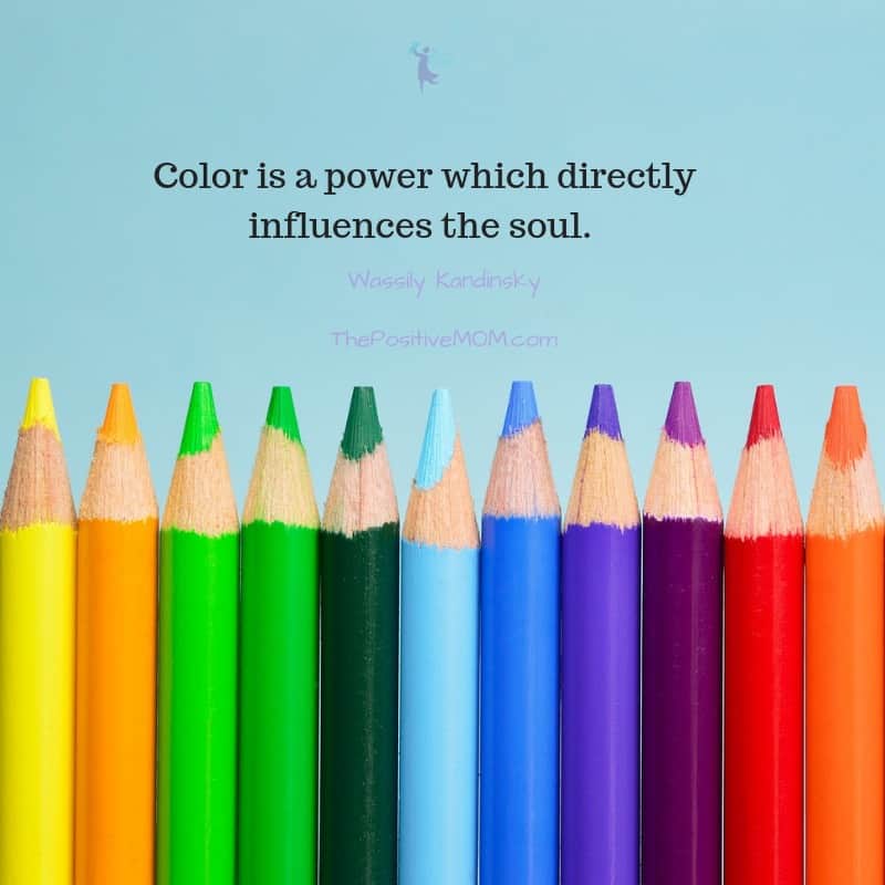
What two hex codes in the Web Safe Color Chart did you choose? Why? Color is a power that directly influences the soul!
Founder of the Positive MOM® and creator of the S.T.O.R.Y. System: a blueprint to craft and share powerful stories that will transform your results and help others do the same. Dr. Elayna Fernández is a single mom of 4, an award-winning Storyteller, Story Strategist, and Student of Pain. She’s a bestselling author, internationally acclaimed keynote speaker, and 5x TEDx speaker. She has spoken at the United Nations, received the President’s Volunteer Lifetime Achievement Award, and was selected as one of the Top Impactful Leaders and a Woman of Influence by SUCCESS Magazine. Connect with Elayna at thepositivemom.com/ef and follow @thepositivemom. To receive a gift from Elayna, click HERE.
Want to support the Positive MOM blog?
The mission of the Positive MOM blog is to help moms break trauma cycles, find peace, and feel emotionally whole, so they can practice supportive parenting and create a positive and healthy environment for their children. If you found Elayna’s content valuable, please consider donating a love offering to enable her to keep creating content and helping more moms worldwide. Donate HERE.
StarTraci
Thursday 9th of October 2025
This is so enlightening - I never knew about the websafe colors!
Nikki Cruise
Tuesday 19th of March 2024
This is so good. Thank you. I can't even begin to answer the question until I have taken some time to really, conscientiously go over it again. So much powerfully equipping information here.
Stephanie Shaffer
Monday 18th of March 2024
What a GREAT article! FULL of information!!!
Thank you Elayna! I learned a lot about my branding colors :)
Phoebe S.
Wednesday 11th of October 2023
Amazing post! I never knew the meaning of color was so important, I've learned so much!
How To Prepare For A Successful Video Shoot And Create High Quality Videos
Tuesday 29th of December 2020
[…] impress! Wear clothing that is clean, ironed, and fits right… not just with your body, but with your brand and […]